
Caetê . estúdio criativo
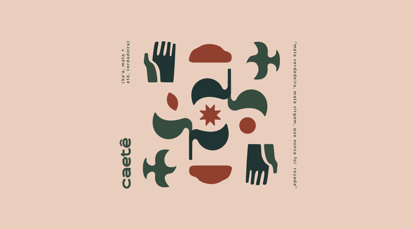
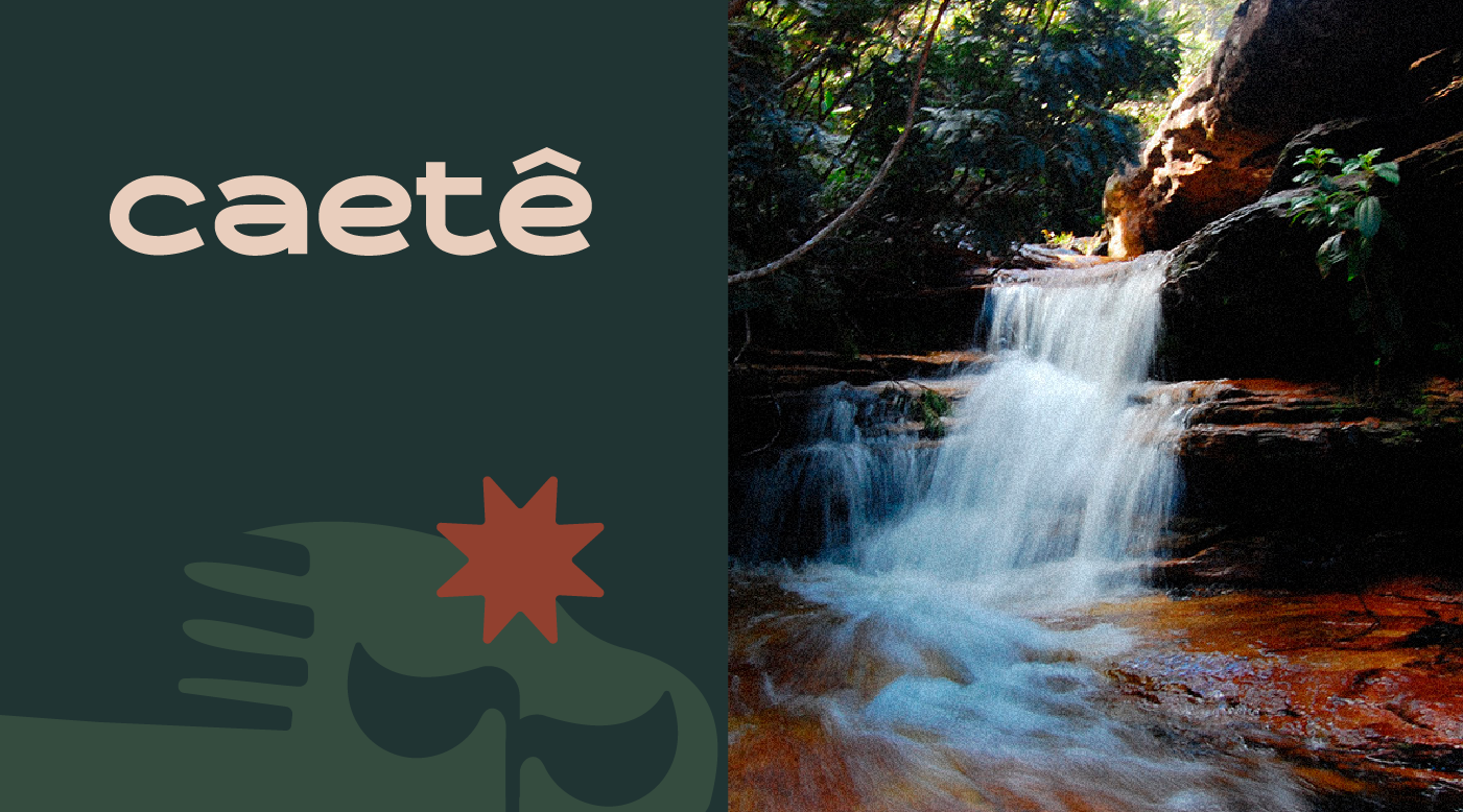
Caeté é originário do termo tupi antigo ka’aeté, que significa “mata verdadeira, mata virgem, que nunca foi roçada” (ka’a, mata + eté, verdadeira).
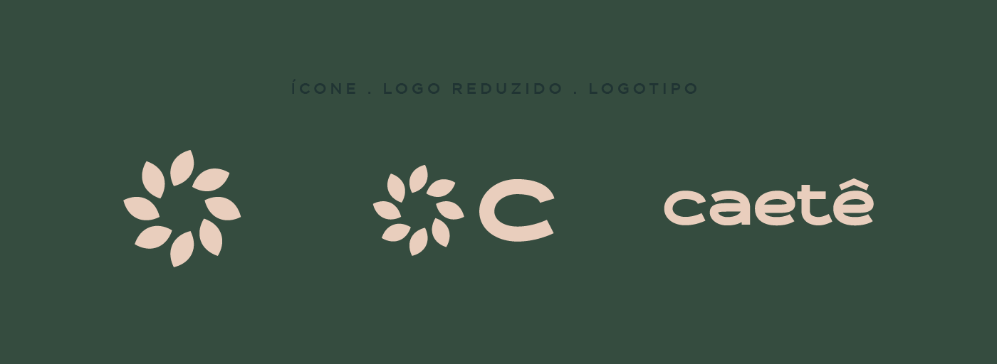
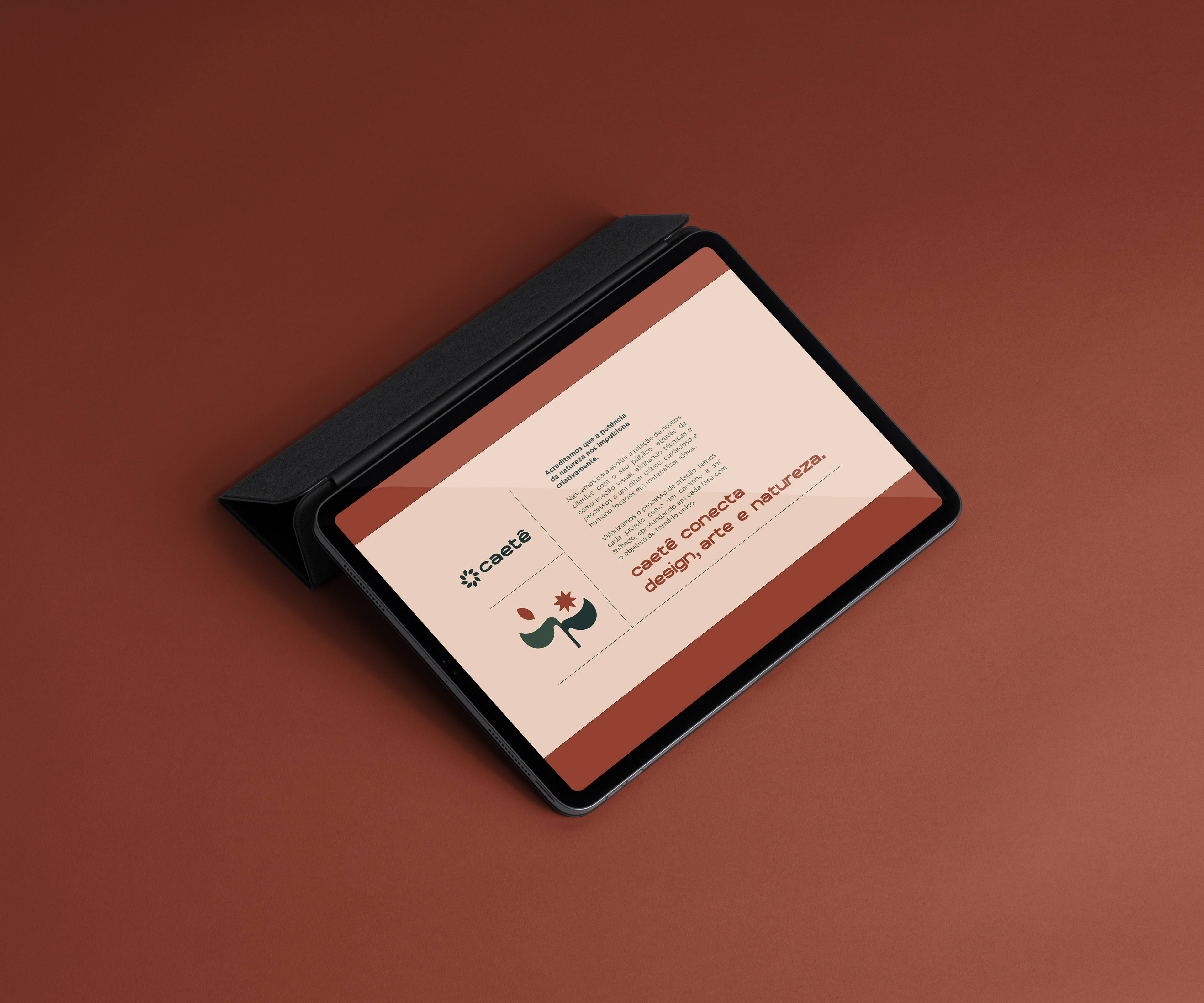
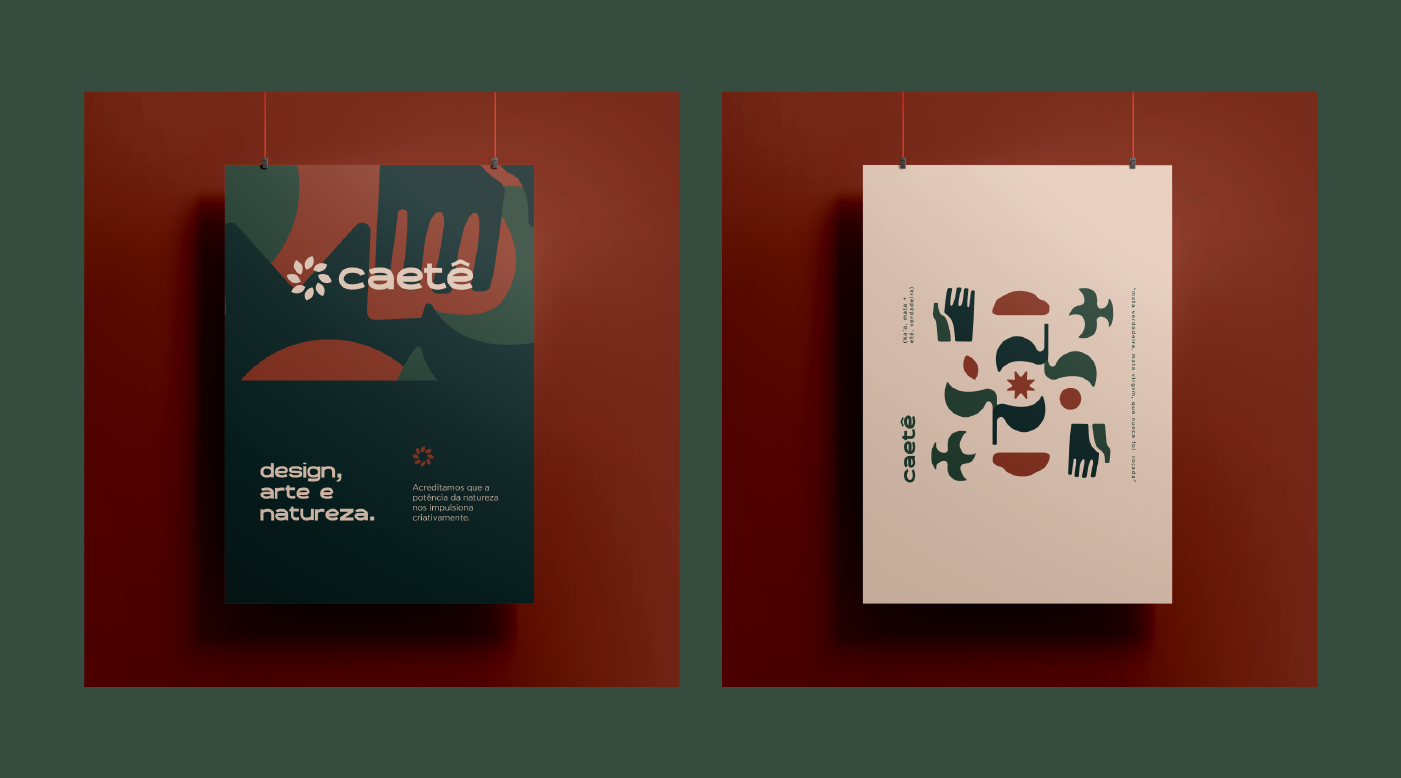
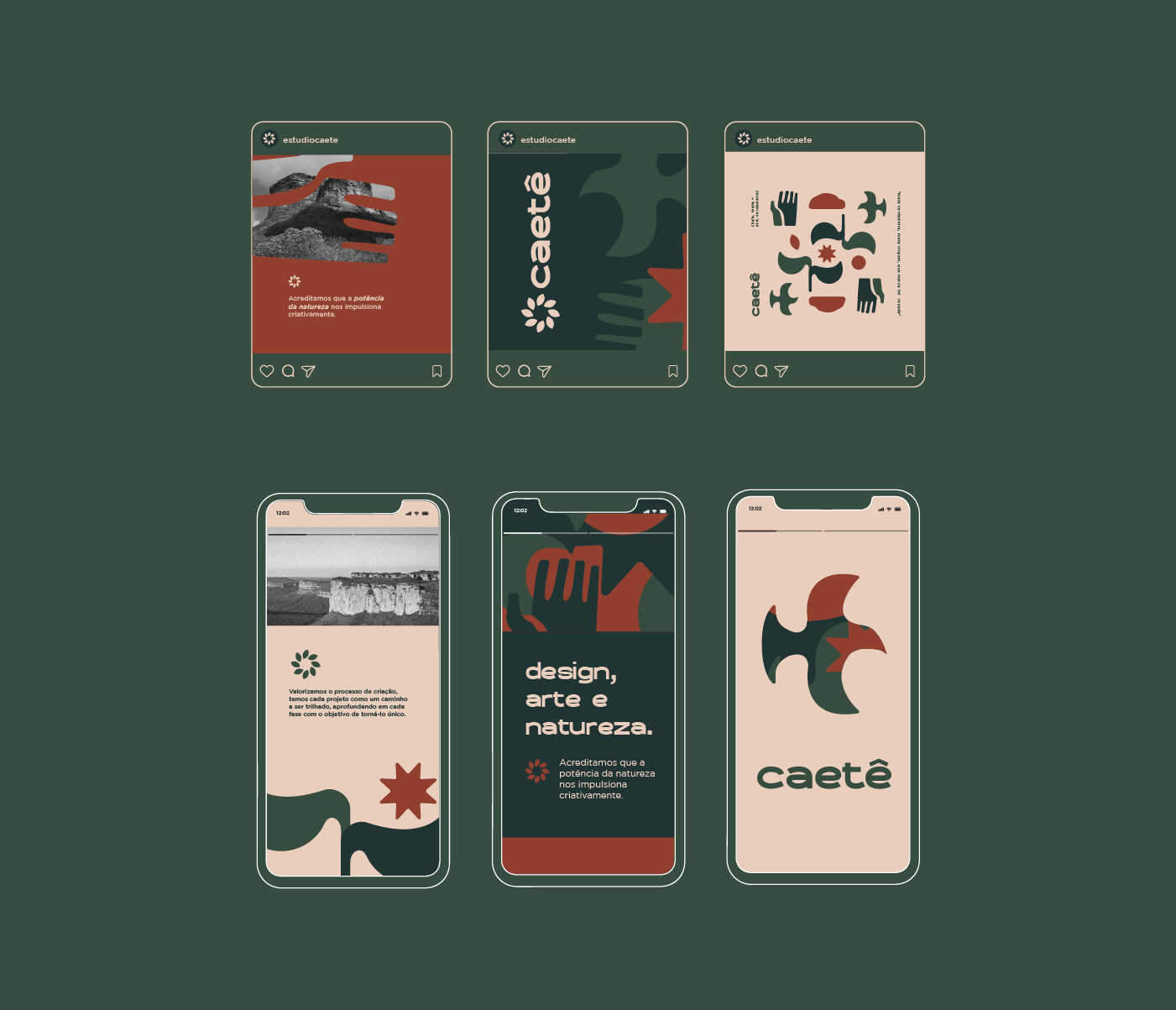
Para comemorar os 10 anos de fundação do Estúdio Caetê, e marcar o novo momento de atuação, com foco em branding, criamos a nova identidade visual do estúdio.
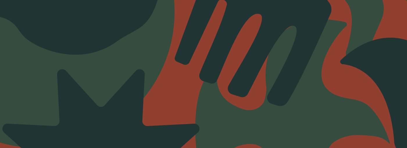
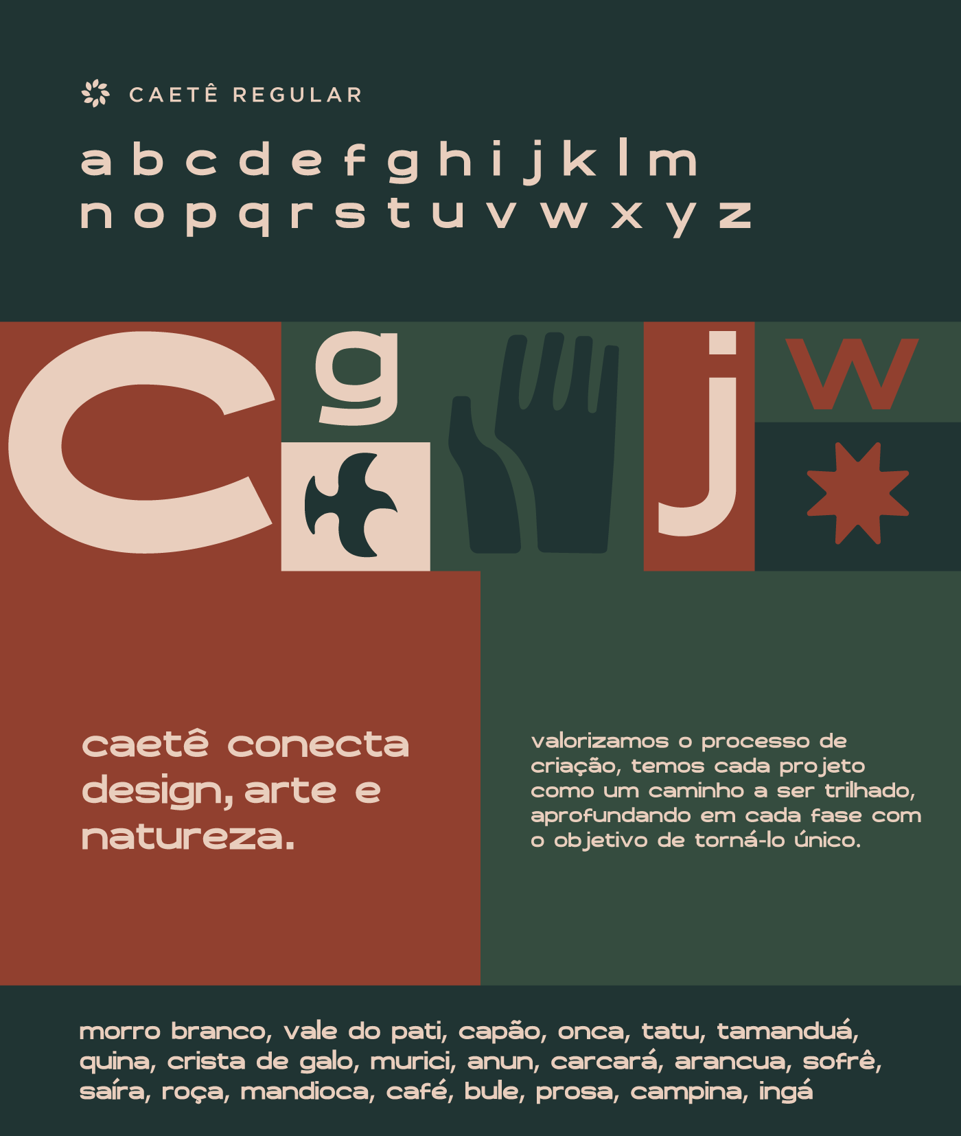
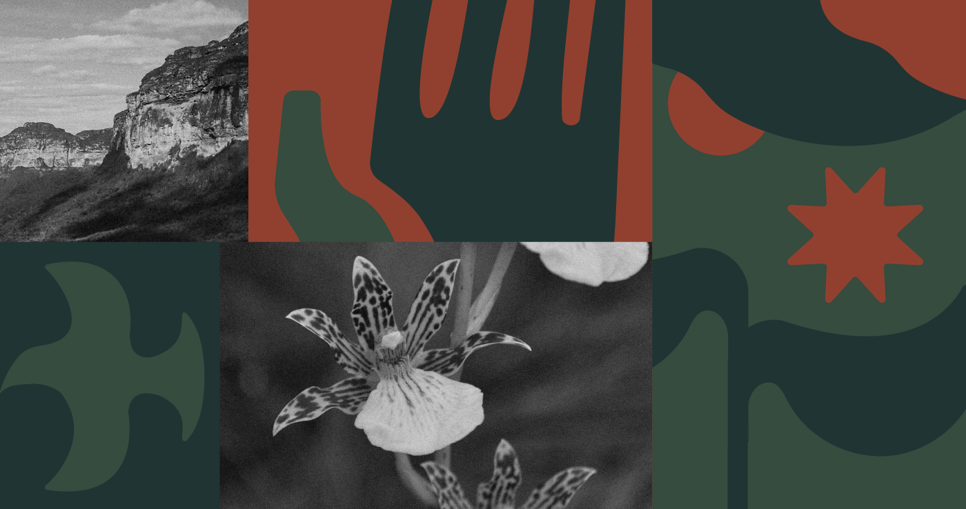
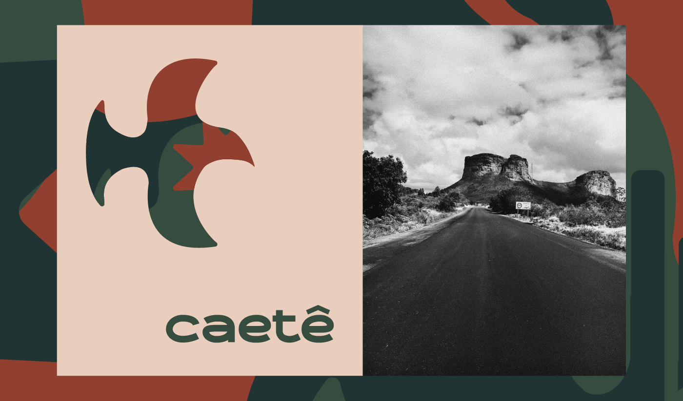
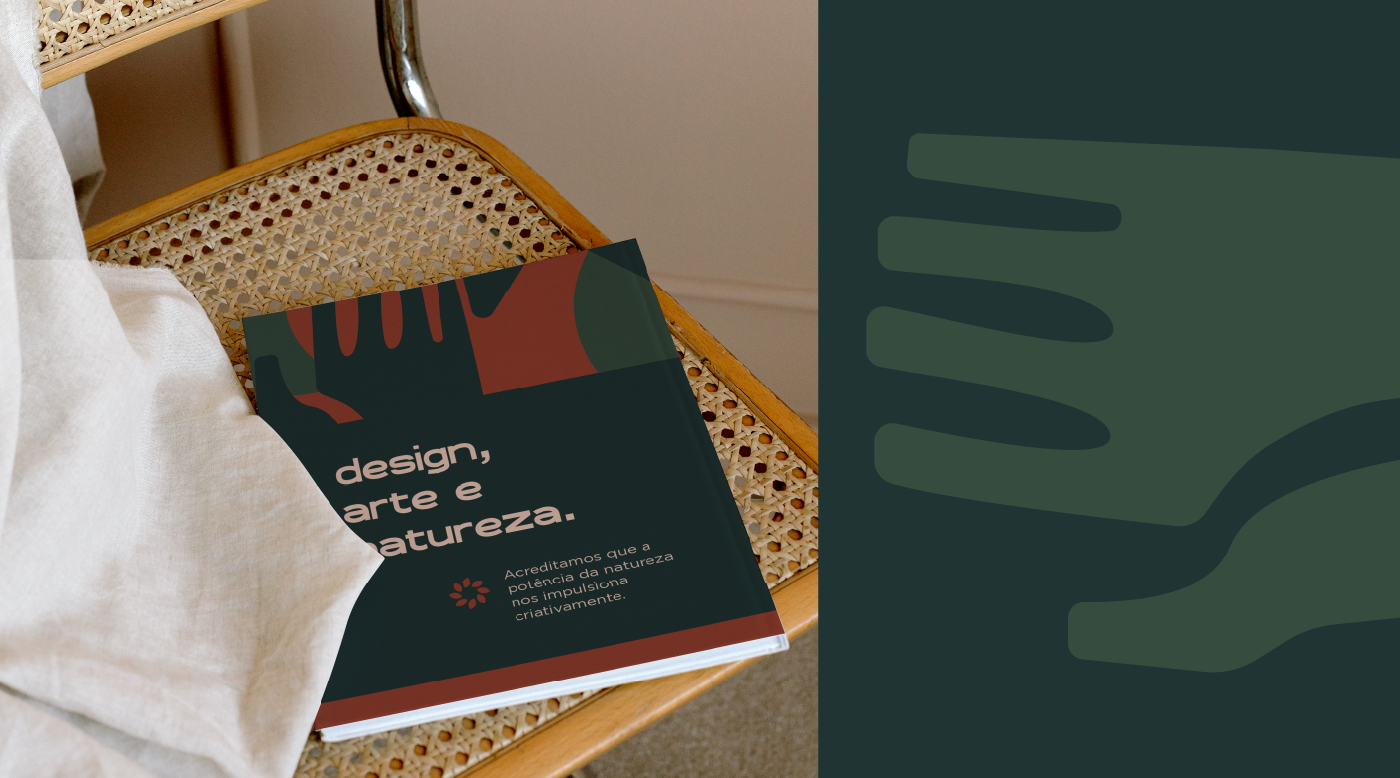
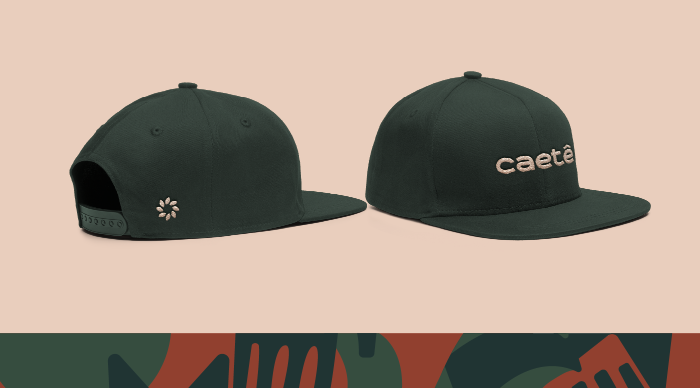
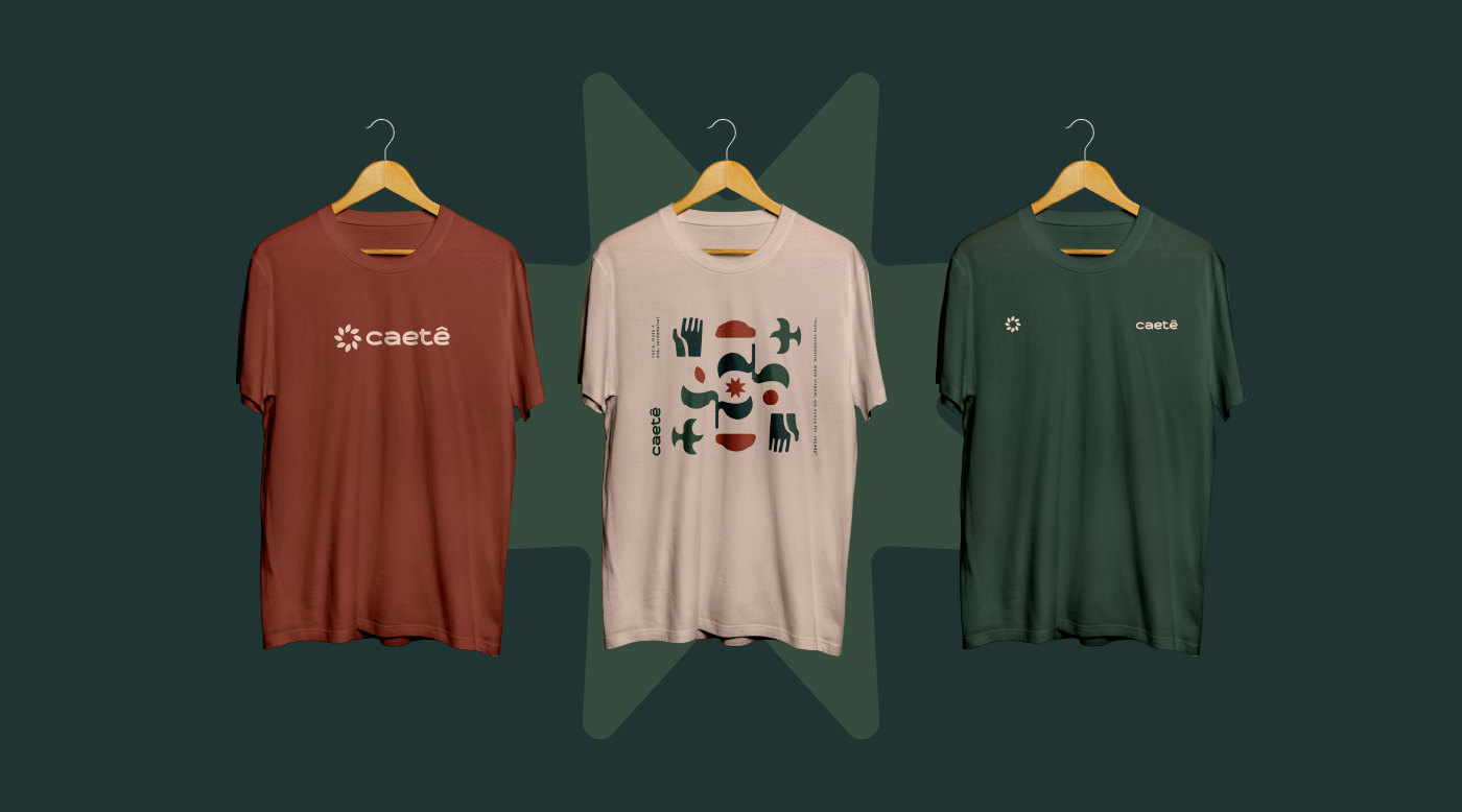
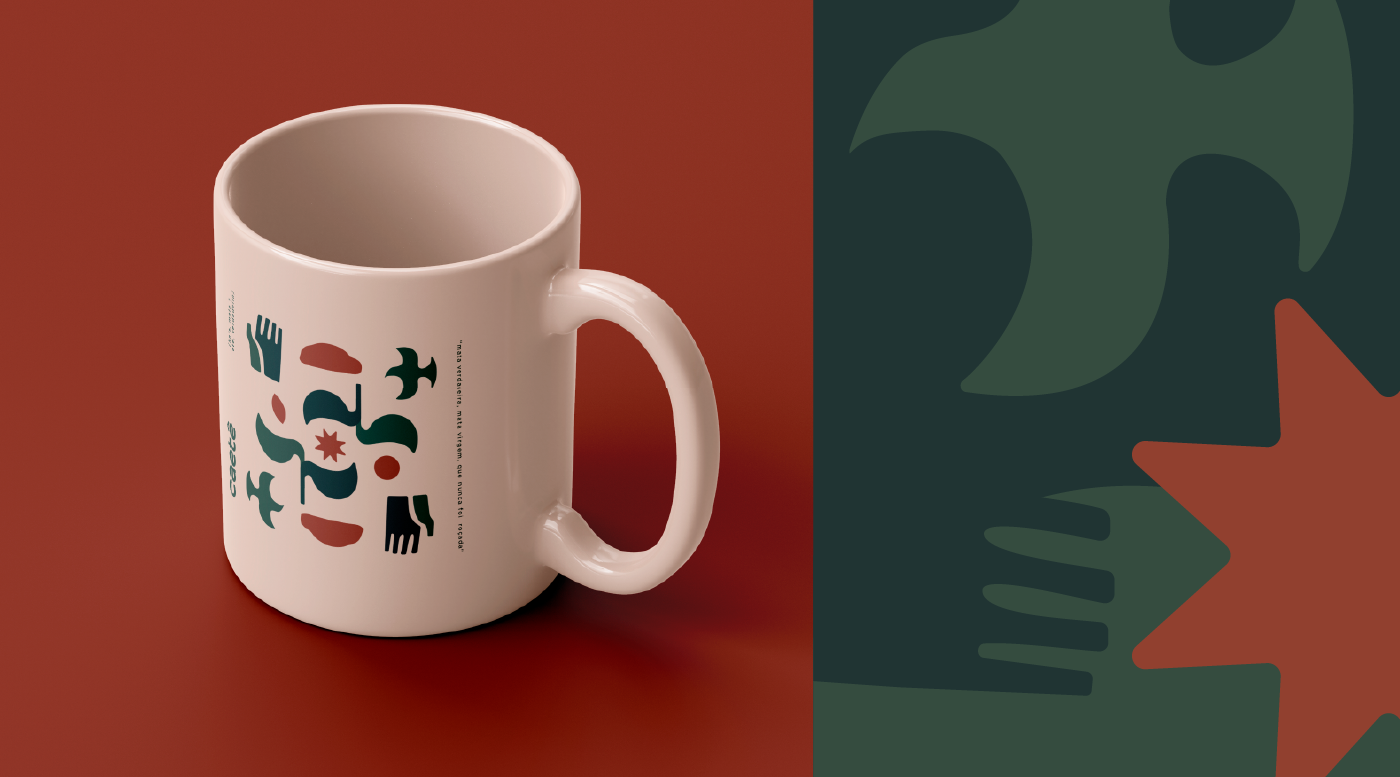
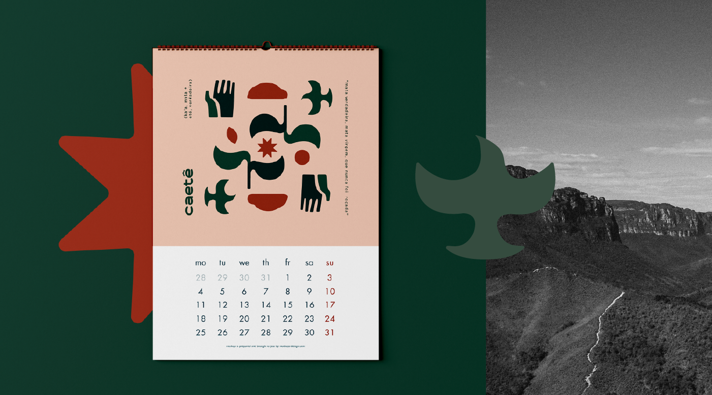
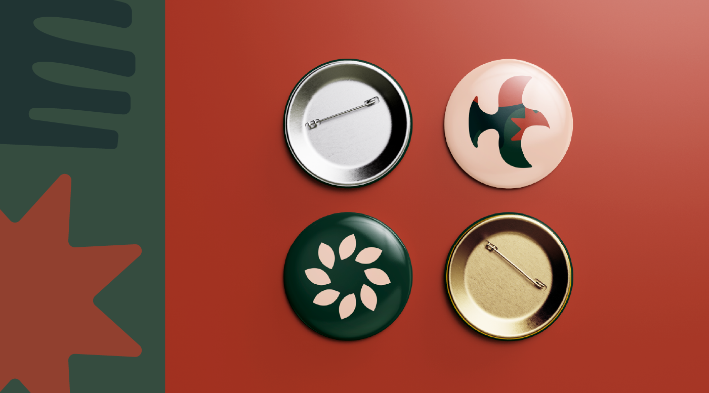
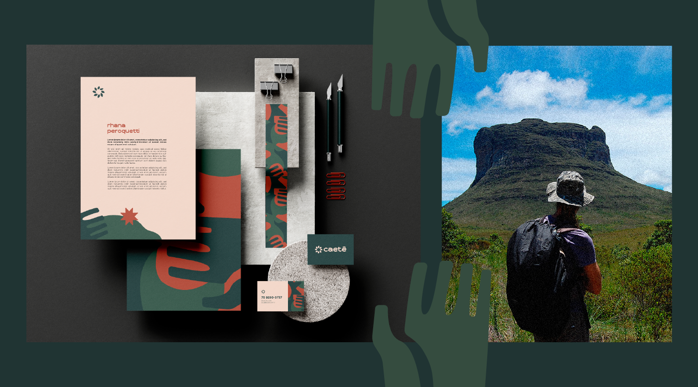
Nossa inspiração está no design modernista brasileiro, passando por Aloísio Magalhães, Athos Bulcão e Burle Marx, bem como na natureza tropical exuberante do Brasil, para então desenhar o logotipo, ícone, elementos gráficos e também a tipografia Caetê Regular, utilizada no logotipo e títulos da comunicação da marca.
EN_
Caeté originates from the ancient Tupi term ka'aeté, which means “real woods, virgin woods, which have never been cleared” (ka’a, woods + eté, true).
To celebrate the 10th anniversary of the founding of Estúdio Caetê, and mark the new moment of action, with a focus on branding, we created the studio's new visual identity.
Our inspiration is in Brazilian modernist design, passing through Aloísio Magalhães, Athos Bulcão and Burle Marx, as well as in the exuberant tropical nature of Brazil, to then design the logo, icon, graphic elements and also the Caetê Regular typography, used in the logo and titles of brand communication.


Project by Estúdio Caetê
Direção Criativa / Creative Direction: Rhana Peroquetti e Victor Verardo
Direção de Arte / Art Direction: Victor Verardo
Logo and icon: Victor Verardo
Typography: Victor Verardo
Designer: Dayane Bonfim
Illustration: Dayane Bonfim
Cliente / Client: Estúdio Caetê